

ULTIMATE FLEXIBILITY FOR A NEWS WEBSITE
Adobe needed a very flexible intranet news site that could change and grow with the company. The existing design was rigid. If priorities shifted, the site wasn't flexible enough to shift with them.
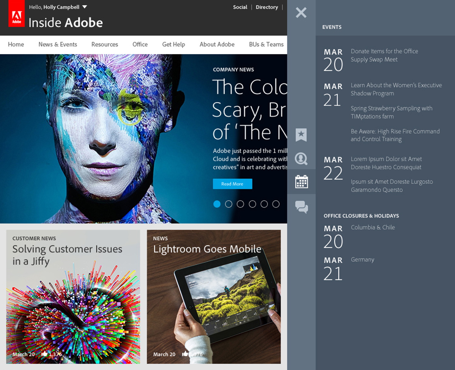
The solution is a flexible, modular, real-time and responsive layout that changes each time the page loads based on the user’s information needs and Adobe's communication needs.

The design is a system made to expand and adapt. Adobe can set the rules and change them too. If an event needs to be promoted, its module can flow to the top of the grid. If a news story needs to be prominent, its module can get bigger. If a press release becomes less timely, it can become smaller and flow to the bottom.

MODULAR GRID
All types of content or functionality can be a made into a module in the grid, from news, local events or functional modules such as activity stream popular resources.

ALWAYS THERE
A drawer was added to contain persistent functions, such as the calendar or popular resources. No matter where the user is on the page or the site, that information can be accessed. Items in the drawer can also be repeated in the flow of content if needed.
Results
Not only was the site named one of the Top 10 Intranets by the Nielsen-Norman Group, but Adobe employees gave it a 92% favorable rating.